Content Oriented Web
Make great presentations, longreads, and landing pages, as well as photo stories, blogs, lookbooks, and all other kinds of content oriented projects.

How the project came to us
A friend came to us saying he had a design project that would be perfect for us.
Project
Brief
Provide branding for a Yoga/Fitness brand. Requirements include, logo designs, icons, color palette and packaging samples. We were only given a name and the freedom to design what we thought looked good and felt appropriate.
Techpack
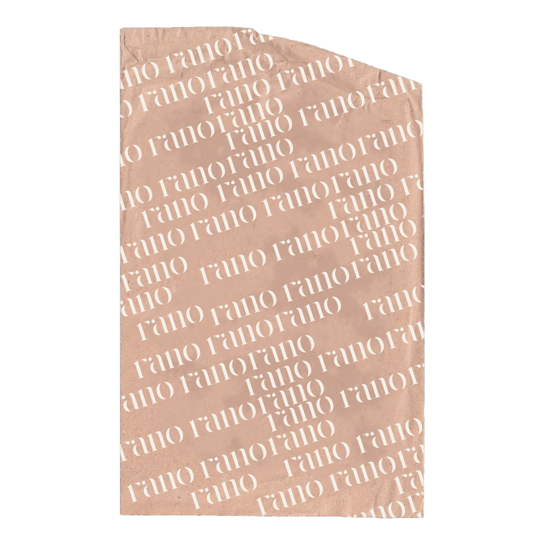
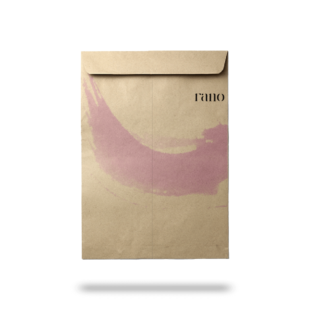
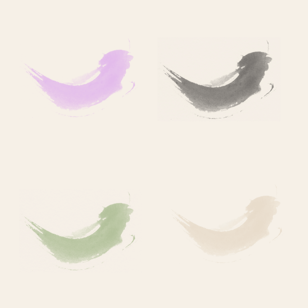
Provided 2 icons, the first is just the letter R from the main logo and the other is a watercolor paint brush stroke. We felt this embodies the free flowing nature of the brand.
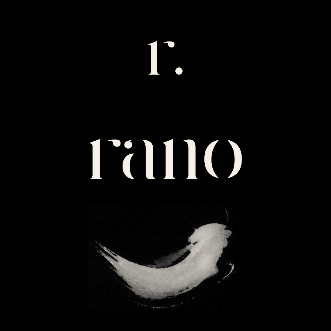
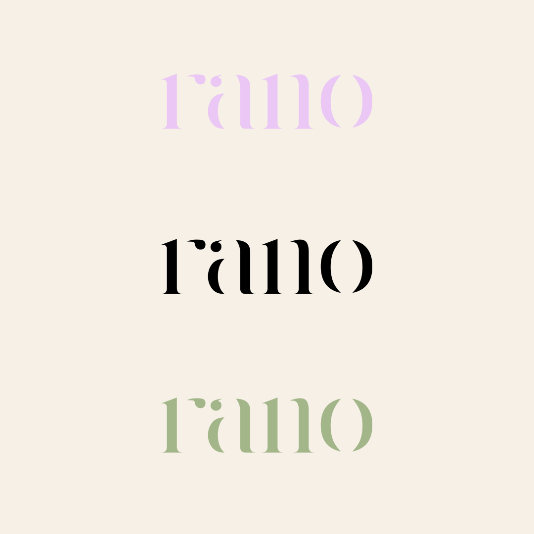
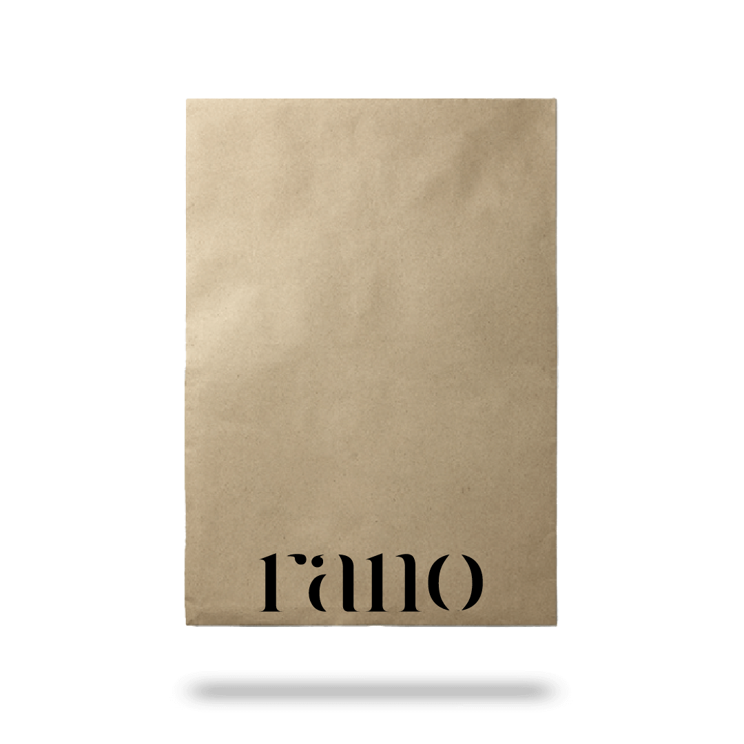
The main logo is pretty simple, but uses the concept of implied lines which involves removing elements of the shape but leaving enough for the brain to fill in the gaps.
The color palette features minimal neutral tones. We felt this was a good balance since a lot of their pieces involved saturated colors.
Results
We provided the main logo, 2 icons, color palette and packaging solution which are all being used to this day.